Welcome to Wattpad’s brand.
Wattpad is where the world goes to share and discover stories in virtually every language. That’s why our brand represents more than our company’s corporate identity—it’s how we connect our global audiences over our shared love of stories.
Writing the next great Wattpad story is hard; using our brand should be easy. We’ve created a simple guideline to help you navigate our brand.
Logo
Our Logo
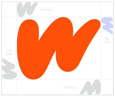
Our Wattpad ‘W’ is bold and dynamic, with its shape connoting forward movement and energy. The organic hand-penned form gives a personal touch, and is a nod to the importance of our Wattpad community.
Our wordmark
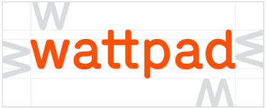
With a nod to mono typefaces and connected ts to symbolize community, our wordmark is built to complement our “W” logo.
Lock-up
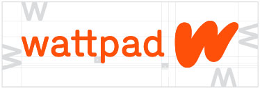
In our horizontal lock-up, the space between the wordmark and ‘W’ has been determined using the height of the descender in the wordmark (x value).
The space around the entire horiztonal lock-up has been created using the height of the ‘W’ in the Wattpad wordmark. Please only use supplied logo artwork.
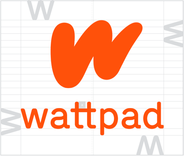
Our secondary logo lock-up can be used when the communication requires a vertical lock-up, but our primary horizontal lock-up is always preferred.
In our vertical lock-up, our ‘W’ has been optically centered above our wordmark. The spacing has been determined by the x-height of the ‘W’ in our wordmark.
Please only use correct artwork of our vertical lock-up as the alignment and spacing have been included.
How to use
Our wordmark should always be used as-is—never stretched, never re-coloured. The space around the entire lock-up has been created using the height of the ‘W’ in the Wattpad wordmark. Please only use supplied logo artwork.
Do not use the old
version of the logo
Do not re-colour
Do not apply a gradient
to the icon or wordmark
Do not rotate the logo
Do not resolve the logo
in two different colours
Do not distort or warp
the logo in any way
Do not outline or create a keyline around the logo
Do not change the
typeface nor recreate or
manipulate the
wordmark and the icon
Our sub-brand wordmarks
As the multi-platform entertainment company for stories, Wattpad is home to unique sub-brands like Wattpad WEBTOON Studios, Wattpad Brand Partnerships, and Wattpad Labs.

Typeface
Din Next Rounded LT
In our line of work, the way words look matter. That’s why we use Din Next Rounded LT as our primary typeface. It strikes a balance between being well-crafted, distinctive, and having a friendly character. Referencing monospaced typefaces, it gives a nod to analogue typewriting but has been modernized to feel timeless.

Light
ABCDEFGHIGKLMOPQRSTUVWXYZ
abcdefghijklmnopqrstuvwxyz
1234567890!@#$%^&*()-+=<>?
Regular
ABCDEFGHIGKLMOPQRSTUVWXYZ
abcdefghijklmnopqrstuvwxyz
1234567890!@#$%^&*()-+=<>?
Medium
ABCDEFGHIGKLMOPQRSTUVWXYZ
abcdefghijklmnopqrstuvwxyz
1234567890!@#$%^&*()-+=<>?
Bold
ABCDEFGHIGKLMOPQRSTUVWXYZ
abcdefghijklmnopqrstuvwxyz
1234567890!@#$%^&*()-+=<>?
Nunito
When Din Rounded LT is unable to be used, for example in an internal Google Slides presentation, Nunito is our closest match. Nunito should never be used in external brand communication.

Light
ABCDEFGHIGKLMOPQRSTUVWXYZ
abcdefghijklmnopqrstuvwxyz
1234567890!@#$%^&*()-+=<>?
Regular
ABCDEFGHIGKLMOPQRSTUVWXYZ
abcdefghijklmnopqrstuvwxyz
1234567890!@#$%^&*()-+=<>?
SemiBold
ABCDEFGHIGKLMOPQRSTUVWXYZ
abcdefghijklmnopqrstuvwxyz
1234567890!@#$%^&*()-+=<>?
Bold
ABCDEFGHIGKLMOPQRSTUVWXYZ
abcdefghijklmnopqrstuvwxyz
1234567890!@#$%^&*()-+=<>?

